This is one part of a comprehensive breakdown of my work with Macrometa. Looking for the entry point? Start here or explore related projects below.
Revamping Macrometa's website was an essential first step in bringing Macrometa's brand refresh to light. The previous site design was based on a Webflow template that had fallen into a state of disrepair and could be scrapped entirely. This was an opportunity to start with a clean slate.
The new design introduced a sharp, modern aesthetic that captures the essence of Macrometa's cutting-edge technology. We prioritized simplicity and visual impact, resulting in a clean, minimalist style infused with bold typography, streamlined graphics, and a refined color palette.
 The new Macrometa home page.
Visual metaphors can be useful in conveying complex ideas and building visual associations in the minds of your viewers, without needingn to actually say anything. They can also just look nice and make a design more interesting.
The accent illustrations that frame the homepage and landing page hero sections introduce a visual metaphor for the underlying technology of the company. They give shape and texture to abstract concepts like "flexible, real-time data layer for the edge". They feel a bit futuristic without being overly indulgent.


Macrometa's brand typography is centered around the Averta typeface, a geometric san-serif family that combines the stable reliability of rounded geometric glyphs with an open, refreshing playfulness. It looks great for large headlines while maintaining sharpness and legibility at smaller sizes.
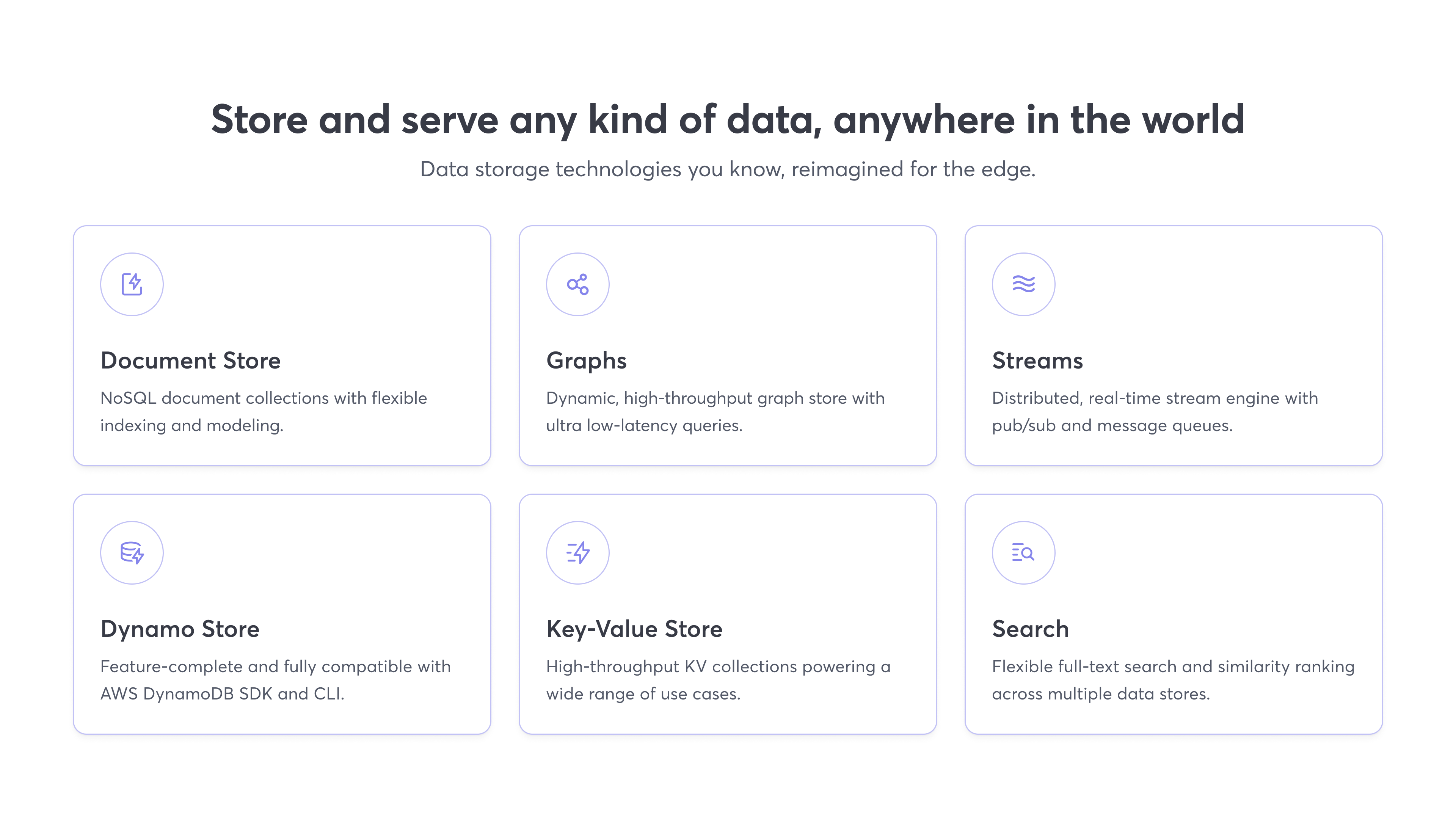 Feature tiles from a product landing page.
I developed this streamlined graphic style for illustrating technical concepts in a way that's visually interesting without clashing with the flow of content.


 Product landing page.
This redesign effort not only elevated Macrometa's online persona but also set a new tone in how we communicate with our audience, blending technical sophistication with a clear, approachable style.
