This is one part of a comprehensive breakdown of my work with Macrometa. Looking for the entry point? Start here or explore related projects below.
From day one, my intention was to raise the profile of this company.
Macrometa had developed truly transformative technology, but from the outside it was more or less impossible to see that. The website, apps, and docs were haphazard, confusing, and lacked any sort of aesthetic continuity from one to the next. Much of the content was full of jargon and nearly impossible to parse. In short, everything had to go. Every single touch point was on my hit list.
My goal was to make what people saw on the outside tell the story of what was on the inside, and in doing so, to elevate the way Macrometans thought about themselves as a company as well.
Over the following year, my team and I did exactly that. This brand refresh played a critical role in that endeavor.
The octopus has long been a cherished creature for Macrometa. Aside from being an amazing, adaptive, wildly intelligent being, it also happens to be a pretty great metaphor for Macrometa's platform architecture. However, the noble octopi is a challenging figure to incorporate into a logo, simply because they're so amorphous and pliable.
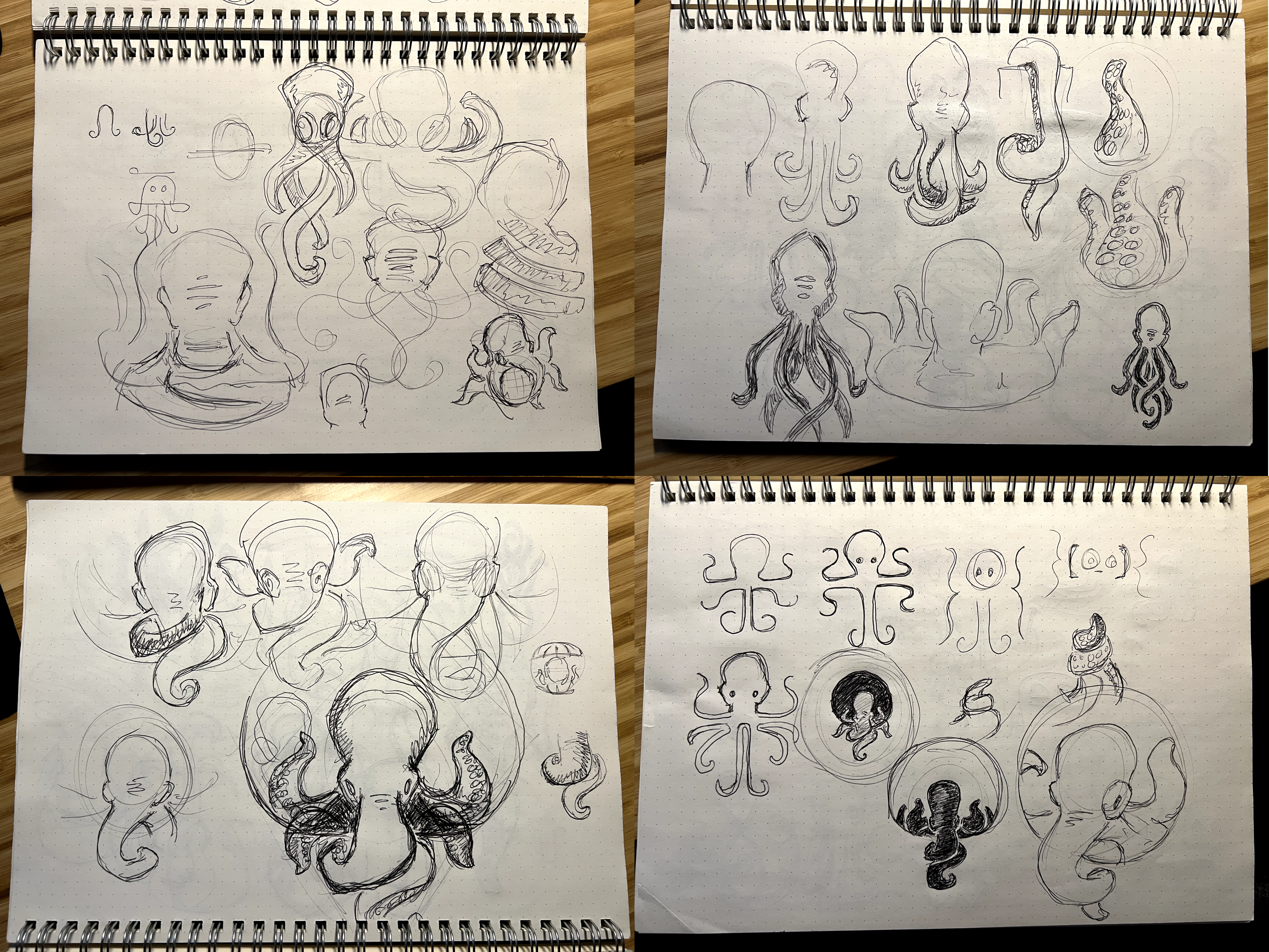
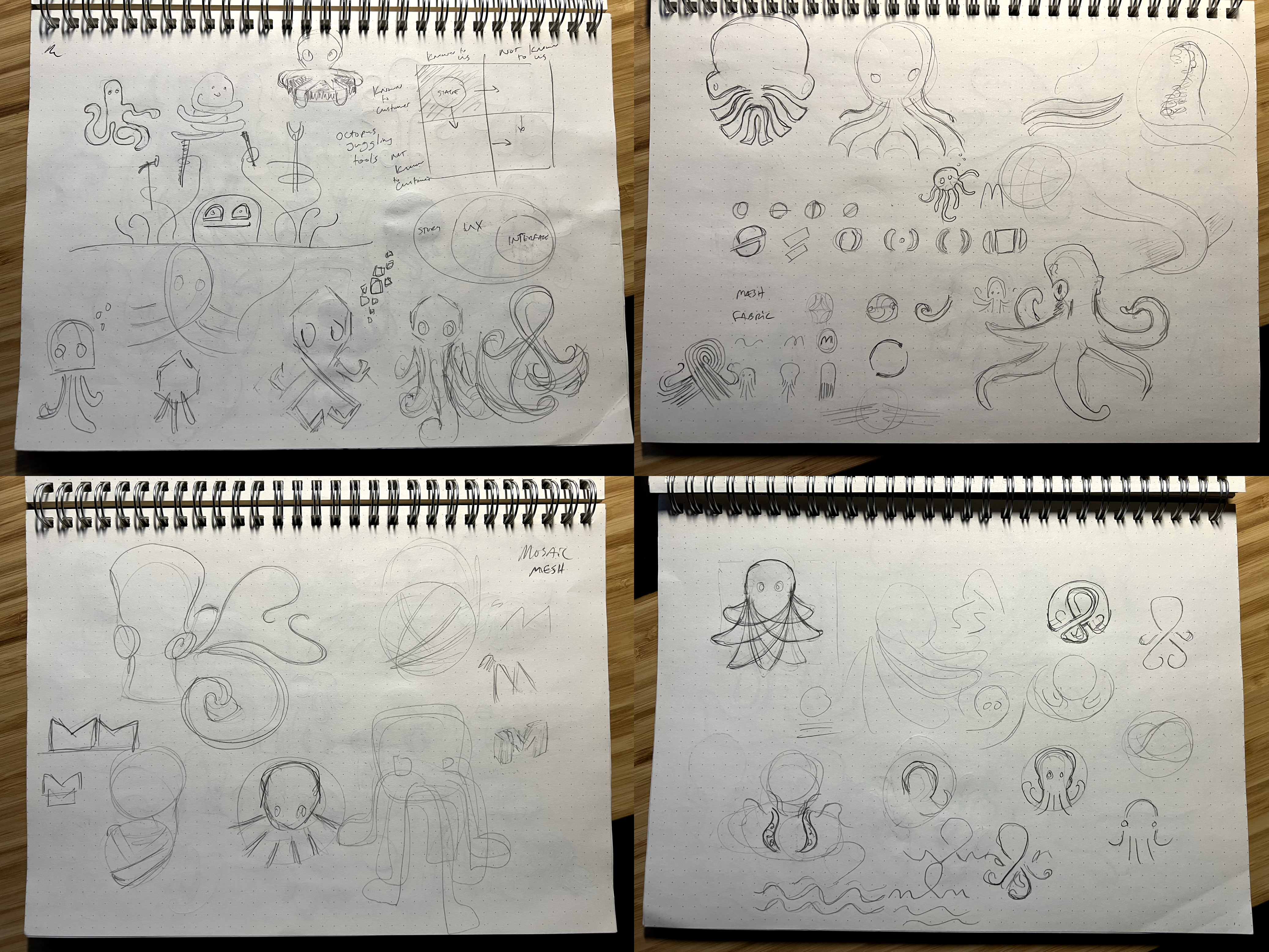
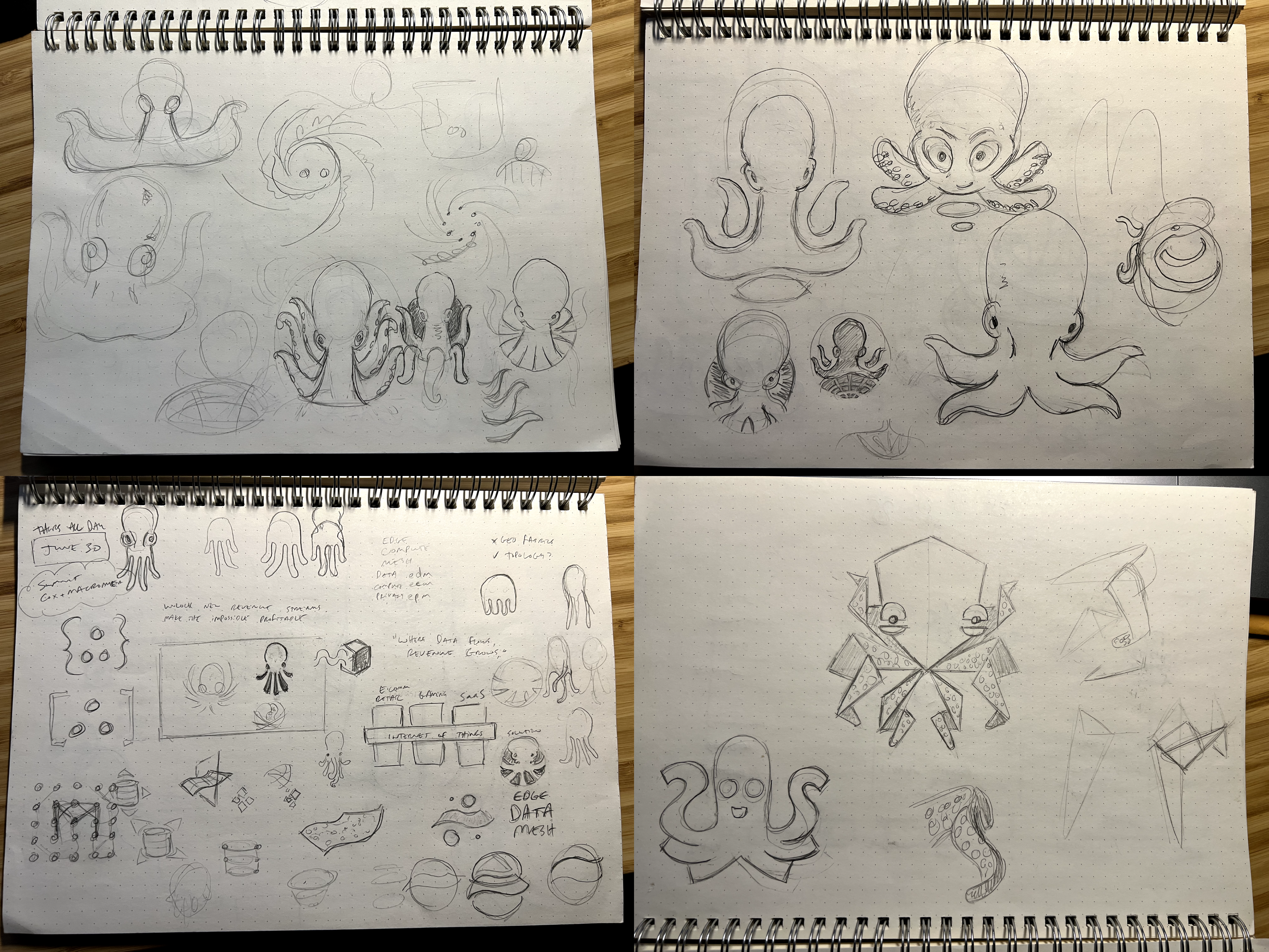
The concept development phase was an exercise in balancing many contrasting characteristics: how detailed vs. abstract, how cartoonish vs. realistic, and how cute vs. serious? Too much or too little in any direction and the concept misses the mark entirely.
Here are a few concepts I considered throughout the process.

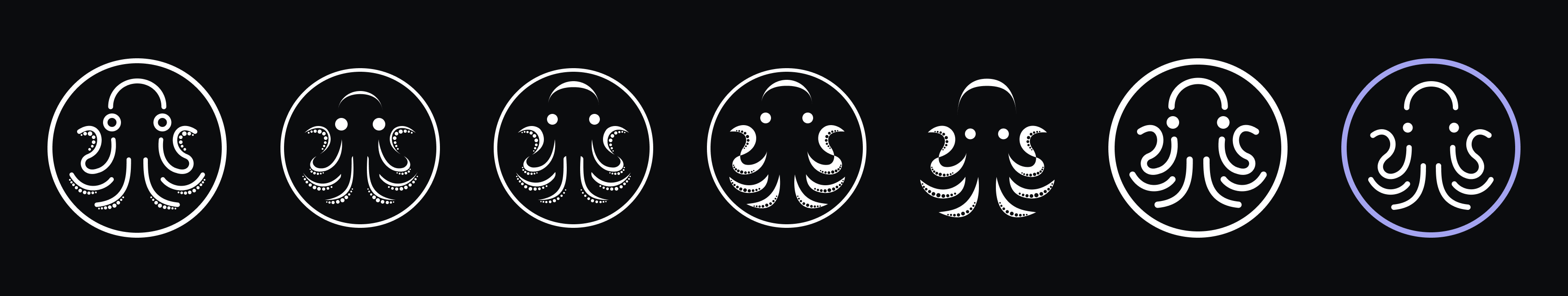
All that said, I'm quite happy with the result.
![]()
This mark brings clarity, symmetry, and confidence into balance with the playful, fluid nature of the octopus. It's unique and yet familiar, expressing its personality and energy wherever it goes.
![]()
![]()
Macrometa's brand typography is centered around the Averta typeface, a geometric san-serif family by type designer and typographer Kostas Bartokas.
I love this typeface. Averta combines the stable reliability of rounded geometric glyphs with an open, refreshing playfulness. It also looks great for large headlines while maintaining sharpness and legibility at smaller sizes.
And it really pops when combined with the new brand mark.
![]() The new Macrometa logo.
The new Macrometa logo.
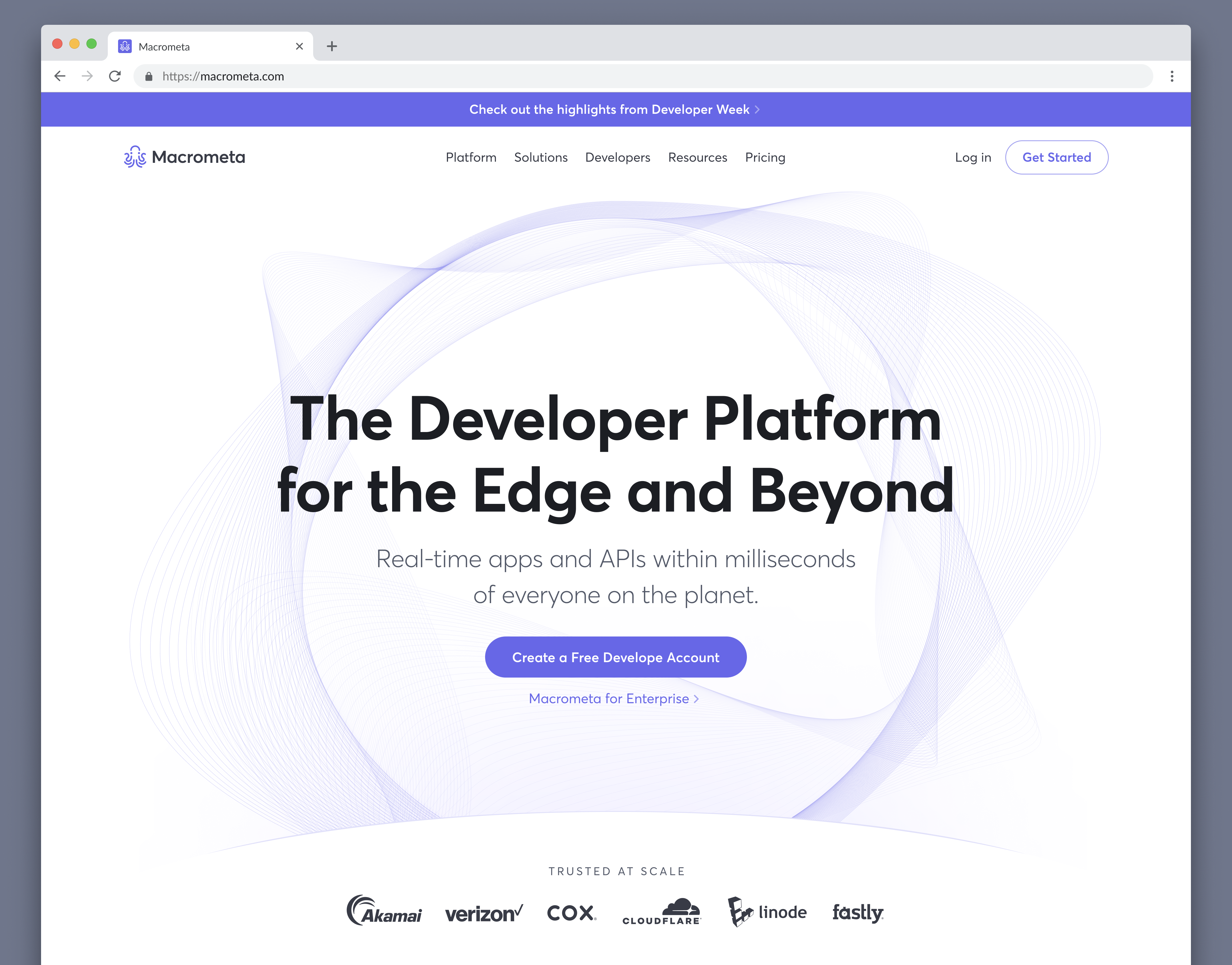 The new logo and brand typography featured on the Macrometa homepage.
 Sticker for the new logo.
A great identity system is only as great as your company's ability to implement it correctly. The last mile of team enablement is a critical aspect that deserves a few notes.
Once we had the foundational pieces in place, my team produced a comprehensive library of brand assets and style guidelines to help our fellow Macrometans get up to speed quickly and confidently.
- Logo and brand mark images, available in a range of sizes, formats, and style variants
- Brand font files, monotype font files, and a Google Fonts alternative for use with Google Docs and Google Slides
- Simplified color palette with primary, secondary, and neutral colors, with a subset of variants
We went further by producing high quality templates and assets that were more applicable to the day to day workflows of teams around the company.
- Slide deck templates and graphics
- Document style templates
- Technical diagrams
- Zoom backgrounds
Designers might be quick to dismiss the idea of helping out with slide decks, but I believe this can have an outsized impact on elevating the quality and tone of conversations happening both within your company and with the world at large, especially for how little effort they require.
This new identity system provided a foundation for every aspect of design at Macrometa. In the months that followed, we performed an extensive visual refresh across every touch point of the company, introducing the new Macrometa to customers, partners, and the general public.
In retrospect, I believe this brand refresh was a big success. I'm proud of what we created and what it has enabled, and I know my colleagues across the company share that sentiment as well.